Do you want to set up a radio station? Before you even decide to listen to an Internet radio, you see it. Whether on online directories, social networks, or on its website, the visual identity of a radio is often the gateway to the relationship it maintains with its listeners. So it’s best not to neglect it!
A well thought-out visual identity will be the marker of your radio’s personality, in addition to showing its professionalism. Let’s take a look at how to create a visual identity when you set up a radio station!
Theme and angle of your radio
Jumping headfirst into your graphic design isn’t the best way to start. We invite you to create a concept for your radio station first. The graphic design will be the visual materialisation of this concept, hence the need to do things in order!
The first step is to define the theme of your radio. Beyond being a requirement for your visual identity, the theme is the starting point when you want to set up a radio station. With an original theme, your radio will stand out from the others. This makes it much easier for listeners to know if it’s for them or not.
If a topic is close to your heart but is already being used by other radio stations, it doesn’t matter! You can stand out by talking about the same subject but with a different angle and tone. For example, if you want your radio to focus on music from the 80’s, you can do it by adopting an ironic or critical angle. You could talk about unknown titles, add historical or cultural details to your content, etc…
→ Here’s a little more on how to make your radio station stand out
To sum up, with a well defined theme and an angle, it’ll be much easier to set up a radio station with a great visual identity.
Name and logo of your radio
The name you give to your radio is a key element in the perception that potential future listeners will have. The name must correspond to the theme and the angle of you have chosen. It should highlight the state of mind or the differentiating factor of your radio, while remaining short and easy to pronounce. (Which isn’t necessarily easily done…)
→ Here you will find our tips for choosing the right name for your radio
The time to create your logo has arrived. Your logo will appear on virtually all visual media related to your radio: directories, website, application, social networks, and even in the press. It’s a major element of the visual identity of your radio station. Your logo must also reflect the spirit of your radio, but most of all, it must be clear and instantly recognisable.
When it comes to creating a logo, you have two options:
- Offer yourself the services of a graphic designer whose job it is. The result will be of professional quality, and you’ll also benefit from expert advice and ideas on the directions to take according to the theme of your radio. Don’t forget, as for any professional service, the creation of a logo by a graphic designer should be paid for! Avoid proposing to “pay in visibility” as is still the case regularly.
- Going it alone in creating a logo. This can be risky if you’ve never really touched computer graphics, but making a good logo doesn’t have to be complex! There are now many free and accessible tools for beginners that will make you happy. However, the tool isn’t always enough. We invite you to search for useful tips to create the logo of your radio.
Here are some radio logos that we find well done:


The colours of your radio station
The colours can be an integral part of your logo (as on the Cosoro Radio UK logo above). But if it’s not the case, you’ll have to choose them carefully to set up a radio station with a great visual identity. The aim of the colours isn’t just to look pretty. They evoke feelings and emotions which should correspond to your theme. Take the time to conduct tests and collect opinions around you (here again, the help of a graphic designer can be precious).
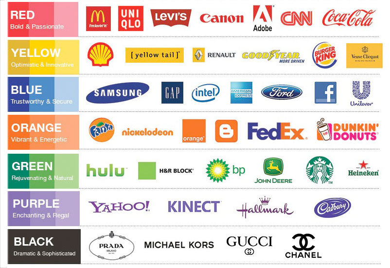
Remember, the colours you choose will follow your radio station for a long time…they’ll be used on all your communication supports, digital or not, so choose wisely!
Attributes and visual aids for your radio
The visual identity of your radio and its colours aren’t only declined by the logo! All your media must be in harmony and reflect the spirit you want to give to your radio station. This includes the aesthetics of your pages on social networks as well as that of your radio player. Let’s take a closer look!
Set up a Radio Station Player
The Radio Player can be integrated on a web page and allows its visitors to listen to your radio with one click. They can even interact with it, for example by “liking” the current track! The Radio Manager allows you to configure it according to your preferences.
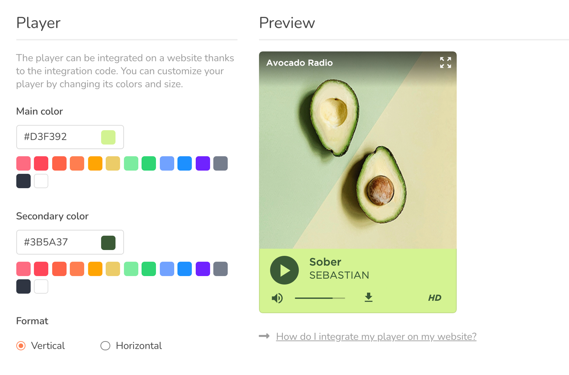
On a design level, use the colours that characterise your radio station. However, beware of certain colour combinations that can limit the readability of texts or be aggressive for the eye.
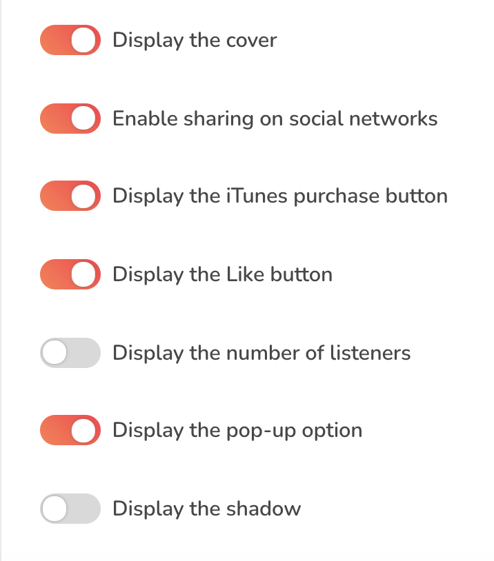
You can also adjust other display settings to suit your preferences and needs.
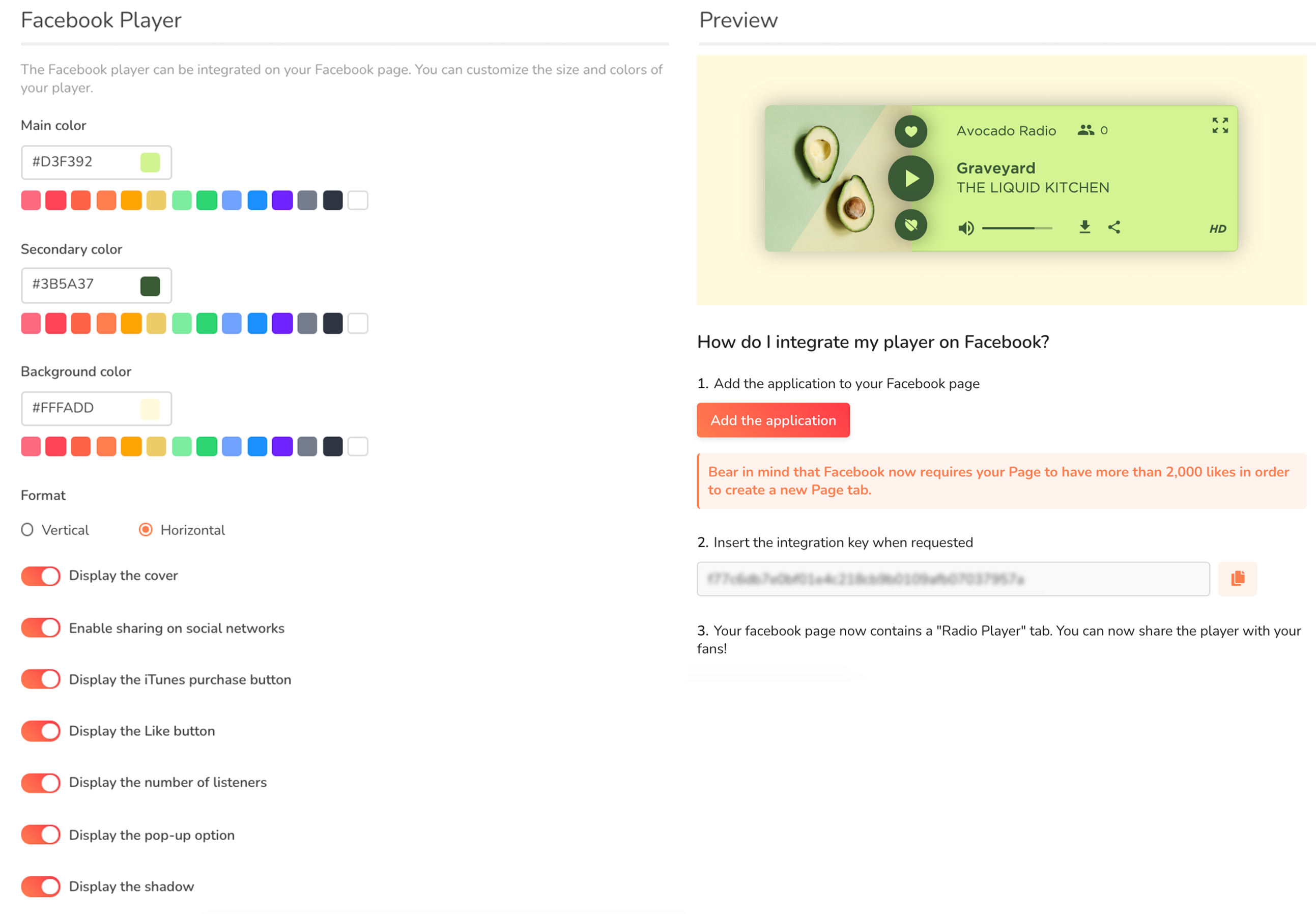
Finally, the Radio Manager also offers a Facebook Player that you can integrate into the “Player” tab of your Facebook page. Here again, highlight your visual identity by assigning colors that can be identified at a glance!
Set up a Radio Station website & mobile app
RadioKing allows you to easily create your own radio mobile application and website. These media have many advantages that can help you become closer to your audience and promote your radio.
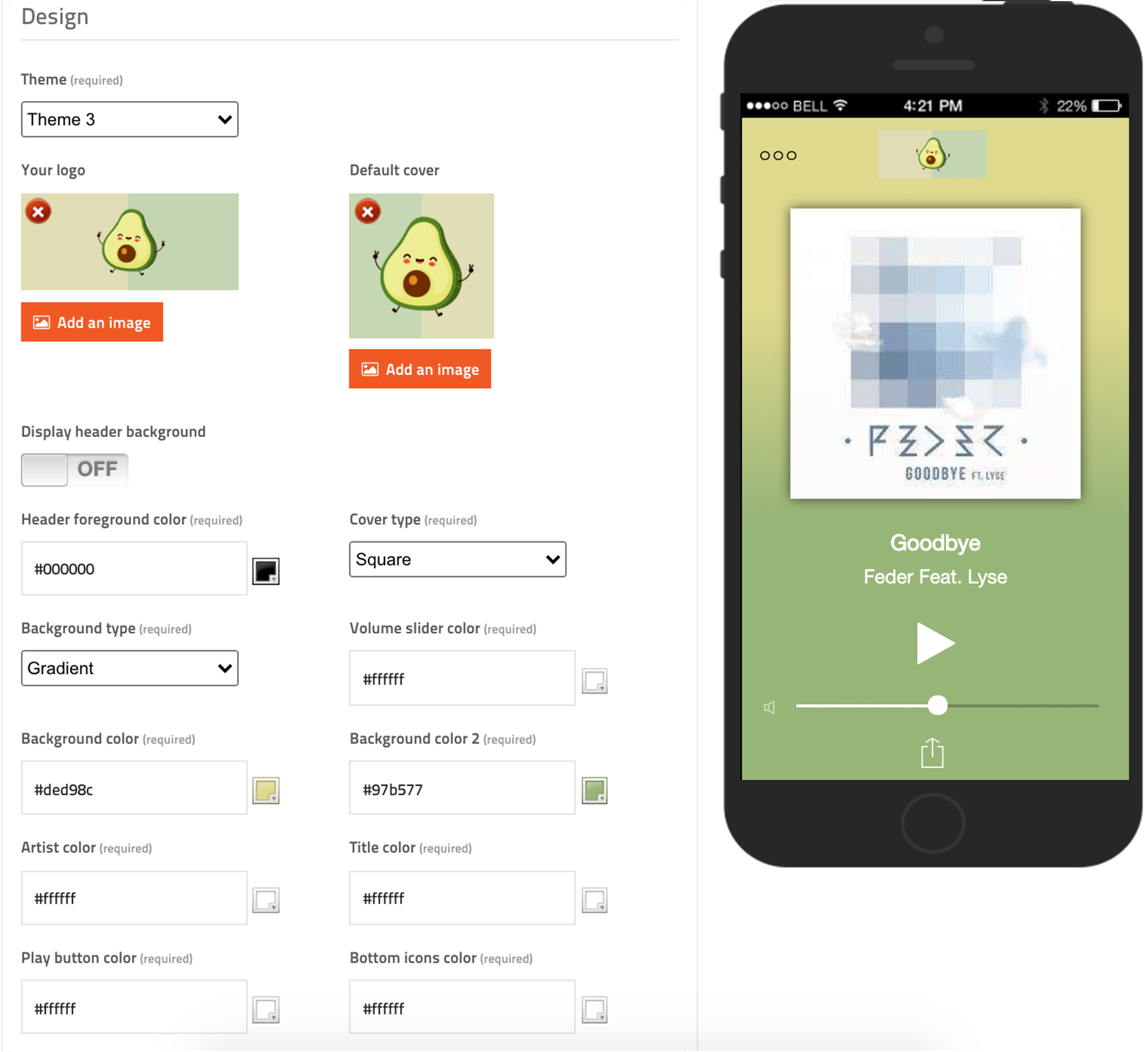
When it comes to visual identity, your application and website must also be in line with your charter. Take the time to configure your interface thanks to the various available settings:
Set up a Radio Station Page
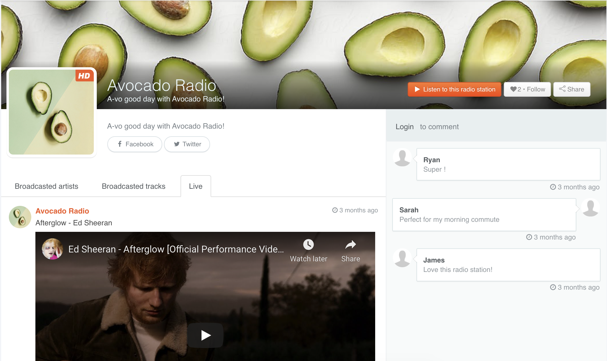
The Radio Page is your profile on the RadioKing Listening Platform. It allows people to listen to your broadcast and even leave comments! You can fill in different information about your radio, redirect to your social networks, and add your logo and a banner.
Setting up this page only takes a few minutes and prevents potential listeners from coming across an incomplete profile that looks amateurish or neglected.
Your image on social networks
Finally, your various social networks are also a showcase not to be neglected. Beyond the colours, your social networks also highlight the positioning of your radio.
For example, your banner may not include a visual with your colours, but a photograph that illustrates the spirit of your radio station. The tone and language with which you express yourself also play an important role in the perception of your radio.
Always make sure to post quality photos and clear, legible illustrations. This is also a great place to post behind-the-scenes photos of your radio station, if that fits its personality!
And there you have it! By following all these tips, you can set up a radio station with a top notch visual identity! Remember, before you listen to your radio, you see it. With a good visual identity, your radio station will be better understood, better perceived and better liked.
We hope that this article was helpful you and that you are motivated to set up a radio station with a great visual identity!
